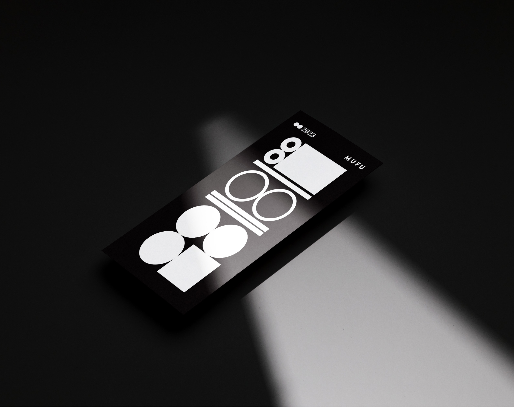
We can’t do anything about the passage of time, but we can do beautiful things during this time. A calendar inspired by Morse code is proof that less is more and there’s no point in pretending otherwise. Short signal, long signal. Dot, dash. The whole year is made up of such signals.
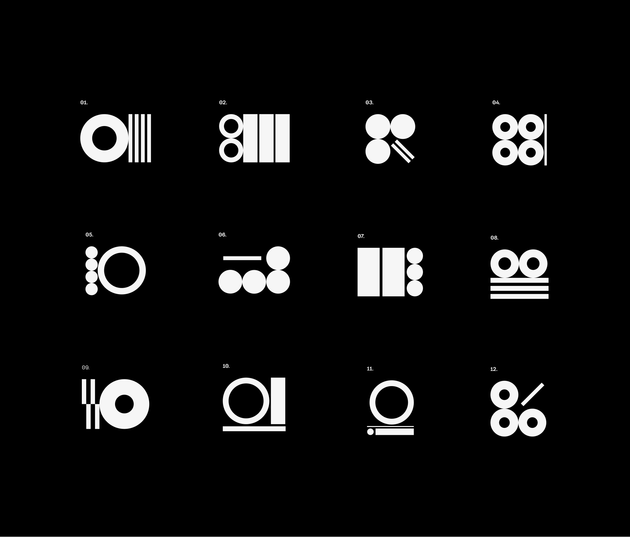
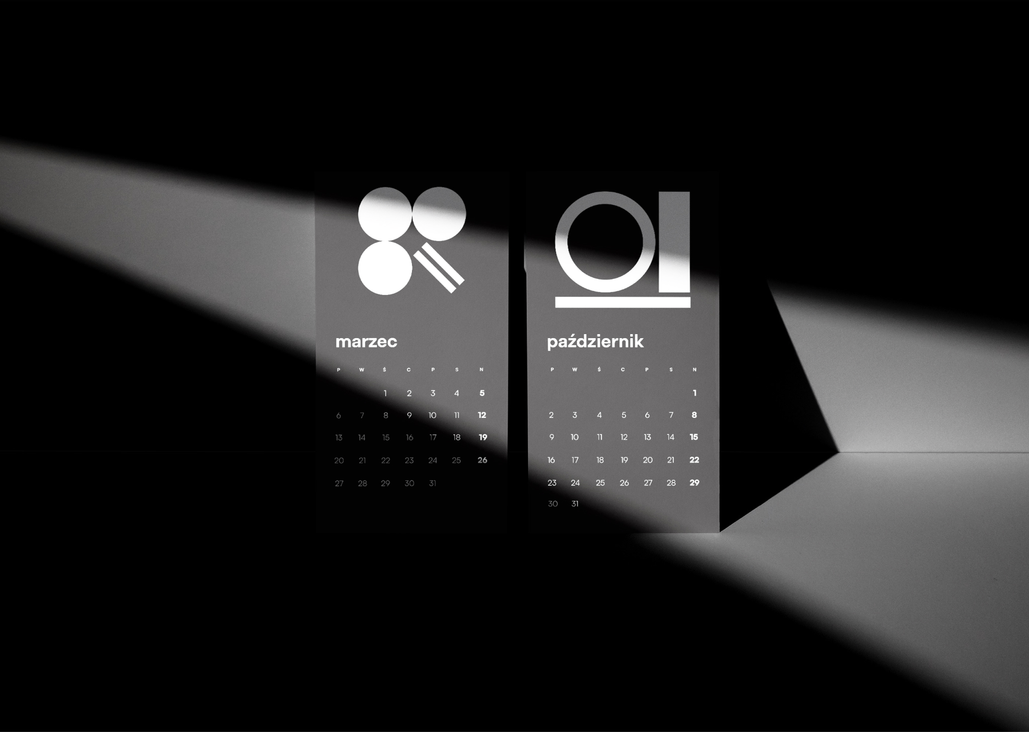
We avoided unnecessary details because simpler is better. We recorded the order of the months with Morse code letters and reaffirmed that every moment in life needs an idea so that time passes more pleasantly.
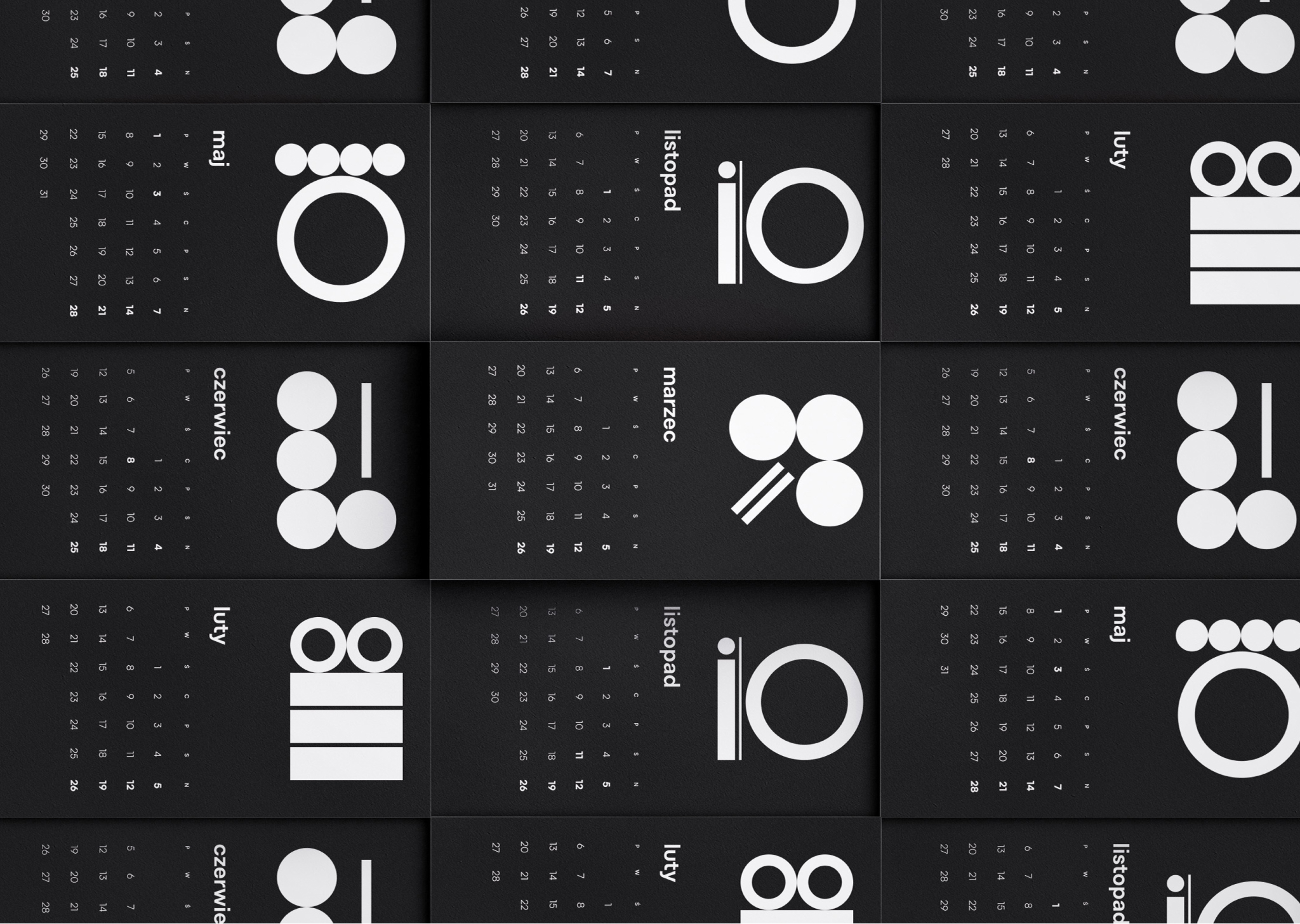
Minimalism and monochromatic design give us a clear view of the year. Each month is a new card and motivates us to start afresh, perhaps even start better and more creatively – with curiosity about the world and what we will find on every page of the calendar.
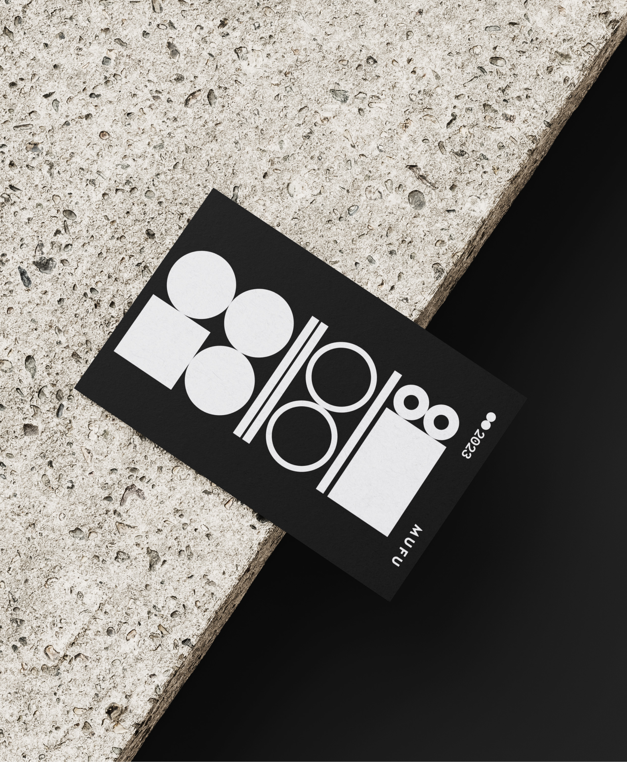
The design of the calendar is an annual tradition at MUFU. Each of our designers has their own idea, and we bring to life the one that seems the most creative to us. The calendar combines functionality with aesthetics, which meets the expectations we have for every brand identity we design.
